One of the oldest brands in the Czech Republic changes its visual identity. OSTROJ introduces a new logo, colors, and font
Author: 
/ 28. 11. 2024


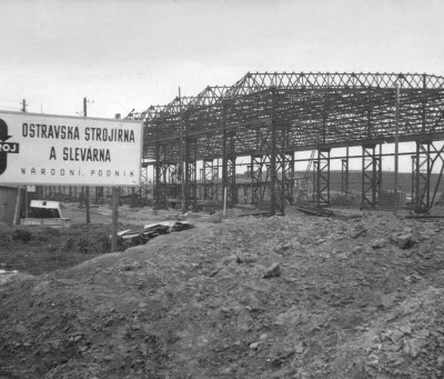
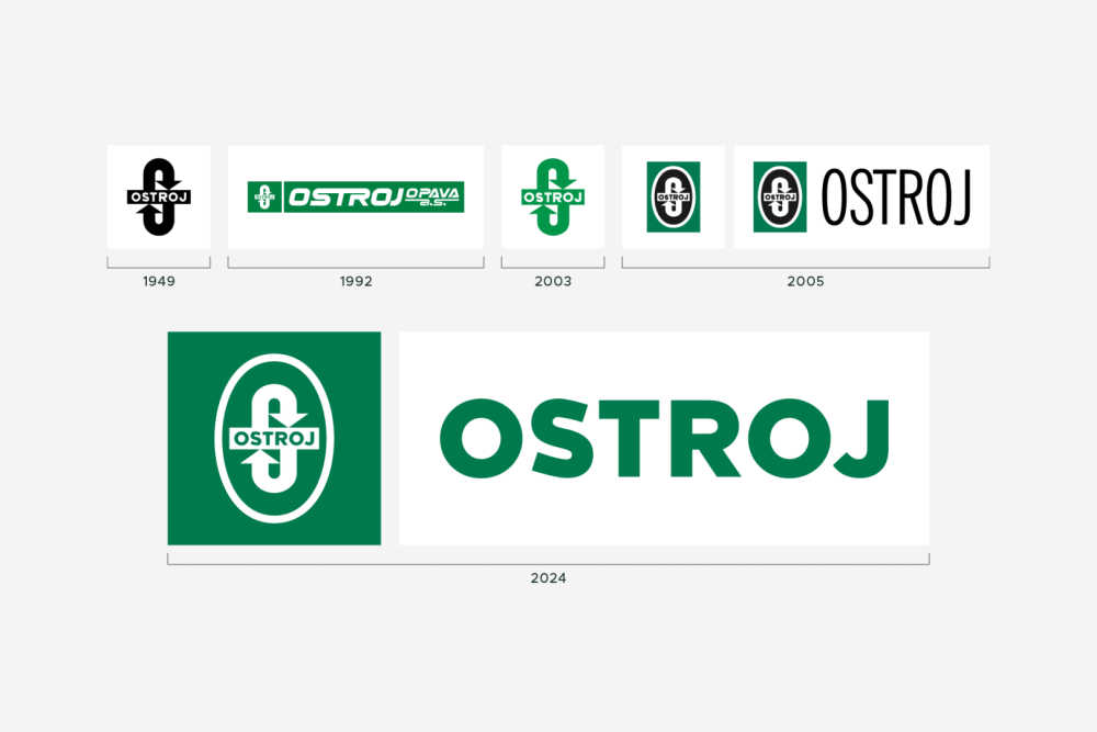
The Opava engineering company OSTROJ is changing its visual identity after more than 20 years. The brand, with a history dating back to 1948, is thus responding to developments in the manufacturing sector and the transformation of its portfolio.
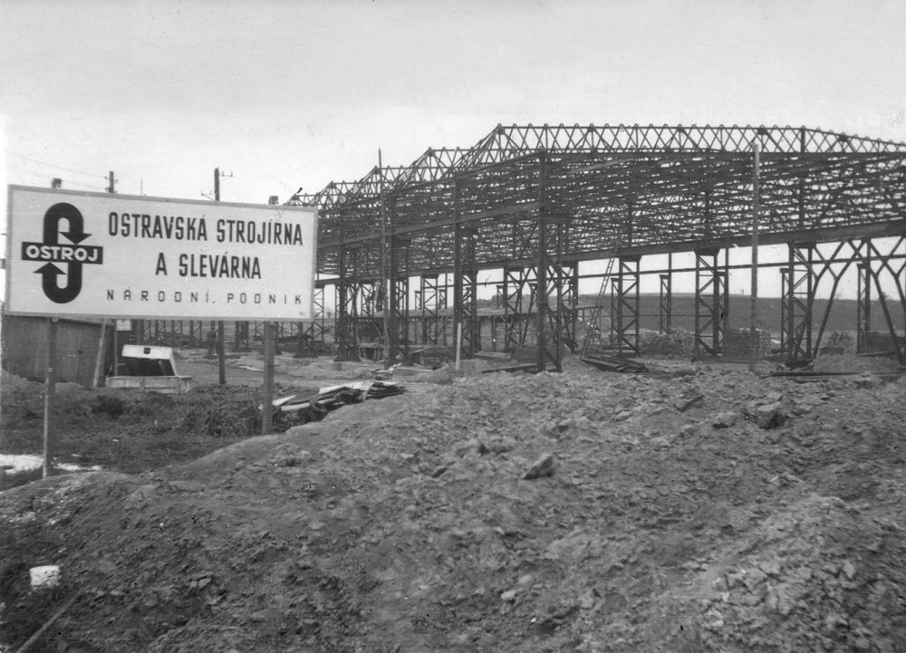
OSTROJ was founded in the late 1940s as a center for the development and production of technologies for underground coal mining. Over the course of its existence, however, it has also participated in the construction of the Strahov Tunnel, supplied parts for ESA, CERN, and the Gabčíkovo waterworks. It now focuses on new product lines, such as mobile steel formwork for tunnel concreting or the supply of lines for industrial automation.
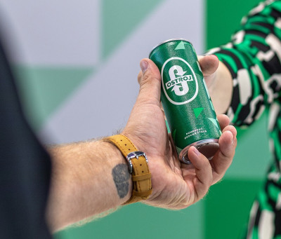
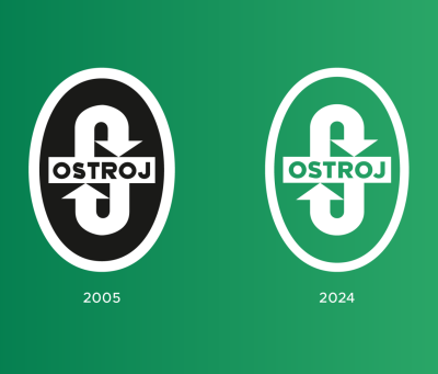
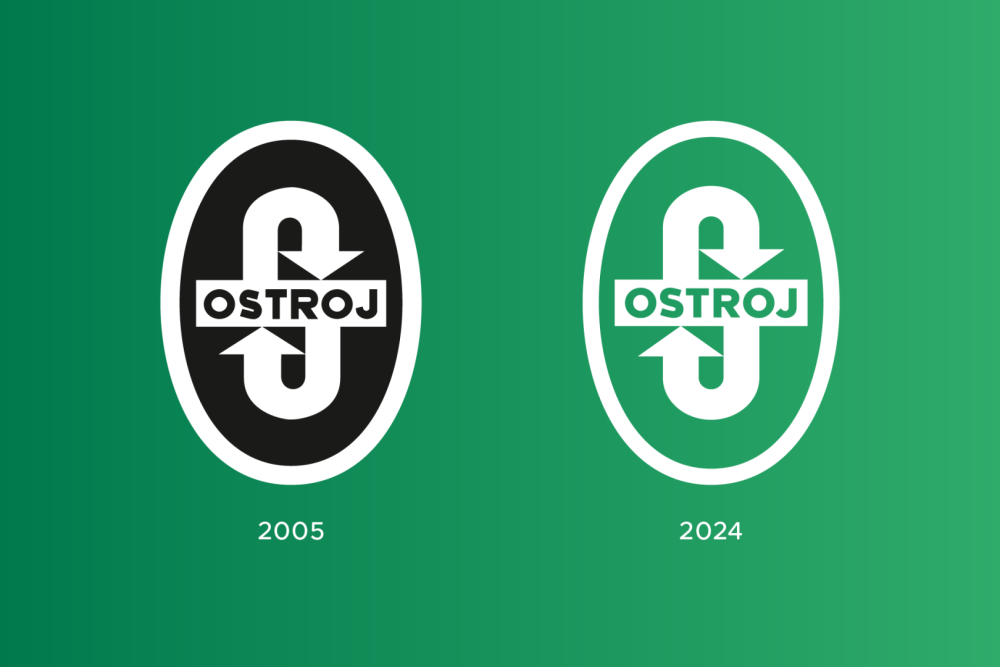
"The company logo has been registered as a trademark since 1949. It is therefore one of the oldest registered brands in the Czech Republic that are still in use," says Petr Fojtík, OSTROJ's marketing specialist. "The arrows in the logo refer to mining, but they also symbolize innovation and moving forward, which are values on which OSTROJ still stands today. The designers were tasked with creating an identity that would be modern but would not close the door on history."
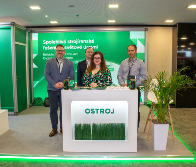
The new logo design retains the main characteristic elements but is adapted for use in the digital world. The newly added separate OSTROJ inscription gives the brand dynamism. "The identity also includes its own corporate font and an expanded color palette, which mainly uses lighter shades of green. This symbolizes technological development, sustainability, and our figurative exit from the mines to the surface, to the construction of tunnels, the production of forgings for the automotive industry, and the implementation of automated conveyor lines," adds Petr Fojtík.
OSTROJ collaborated with the Zlín-based marketing agency KHS on the new identity. "When working on the new identity, we decided to preserve the traditional logo and build on its original design. We slightly optically refined the symbol to better meet modern requirements, and we supplemented it with a visual style that naturally derives from the logo itself in terms of font and shapes. The new visual style underlines the brand's growth and helps it stand out better in the market, while still respecting its traditions and roots," describes Adam Komůrka, creative director of KHS.
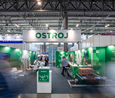
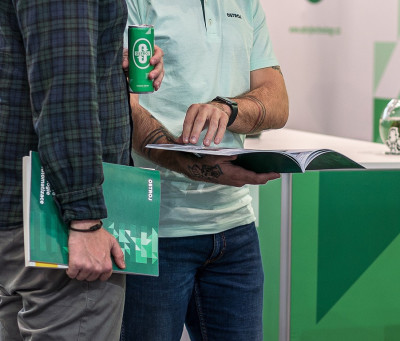
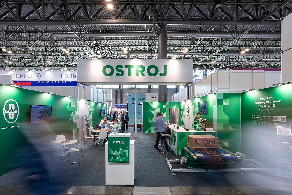
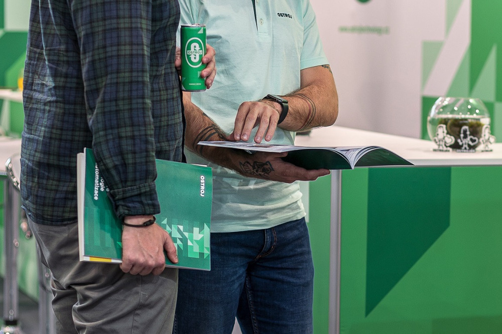
OSTROJ has already presented the new visual style at several public events, including the recent International Engineering Fair in Brno. The next step is the planned website, and during 2025, the company will incorporate the new identity into its internal processes and daily communication.


 Read more